
In my previous post, I talked about the practical reasons to use monospace fonts and introduced four system default fonts: Consolas, SF Mono, DejaVu Sans Mono, and Roboto Mono.
Here’s to refresh the memory:
| Operating system | Default monospace font |
|---|---|
| Windows 10 | Consolas |
| macOS | SF Mono |
| Linux | DejaVu Sans Mono |
| Android | Roboto Mono |
In addition to these four system fonts, I also mentioned Menlo and Monaco as deprecated default macOS fonts. In this blog post, I will give a subjective comparison of these 6 typefaces, as well as their respective historical backgrounds. Buckle up and sit tight!
Consolas
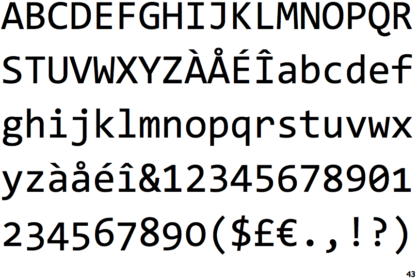 Consolas
First on the list is Microsoft’s Consolas, which happens to be my all-time favorite monospace font. For practical use, I love the thicker characters that enhance readability at smaller sizes, and the generally narrower body to allow more columns to be shown in my code editor. The details in the low-hanging “r”, slightly triangular angles of “M”, the slanting vertical line of the dollar symbol, and the elongated comma are in my opinion, what makes this font elegantly timeless. In general, I also prefer the look of a looptail double-storey “g”, instead of an opentail single-storey one, which is found on SF Mono, Menlo, DejaVu, Roboto Mono, etc. On top of that, Consolas is also classified as a “humanist” font (my favorite category), as opposed to being neo-grosteque such as the other fonts on the list.
However, nothing is perfect, and there are two things that bug me about Consolas. First, the italic version of lowercase “k”. Cool as it may be, the cursive loop on top makes the character somewhat stand out unnecessarily every time I glance through a codebase.
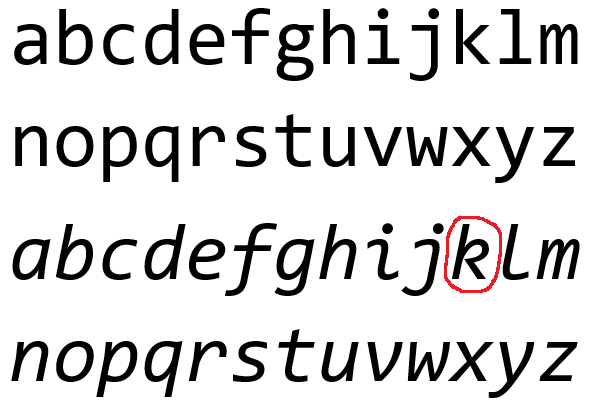 Consolas’ italic k can be distracting at times
The other problem I have might be due to the ClearType technology behind the font. Consolas changes the body weight from its regular thickness to a lighter version (despite it not “actually” having a light font-weight option) when the font size is smaller than a certain threshold. On some screen resolutions, that threshold is somewhere around 9 pt. The behavior is kind of hard to describe, but if you manually zoom in and out of the display font size (not from a screenshot, of course), you might pick up what I am talking about.
SF Mono
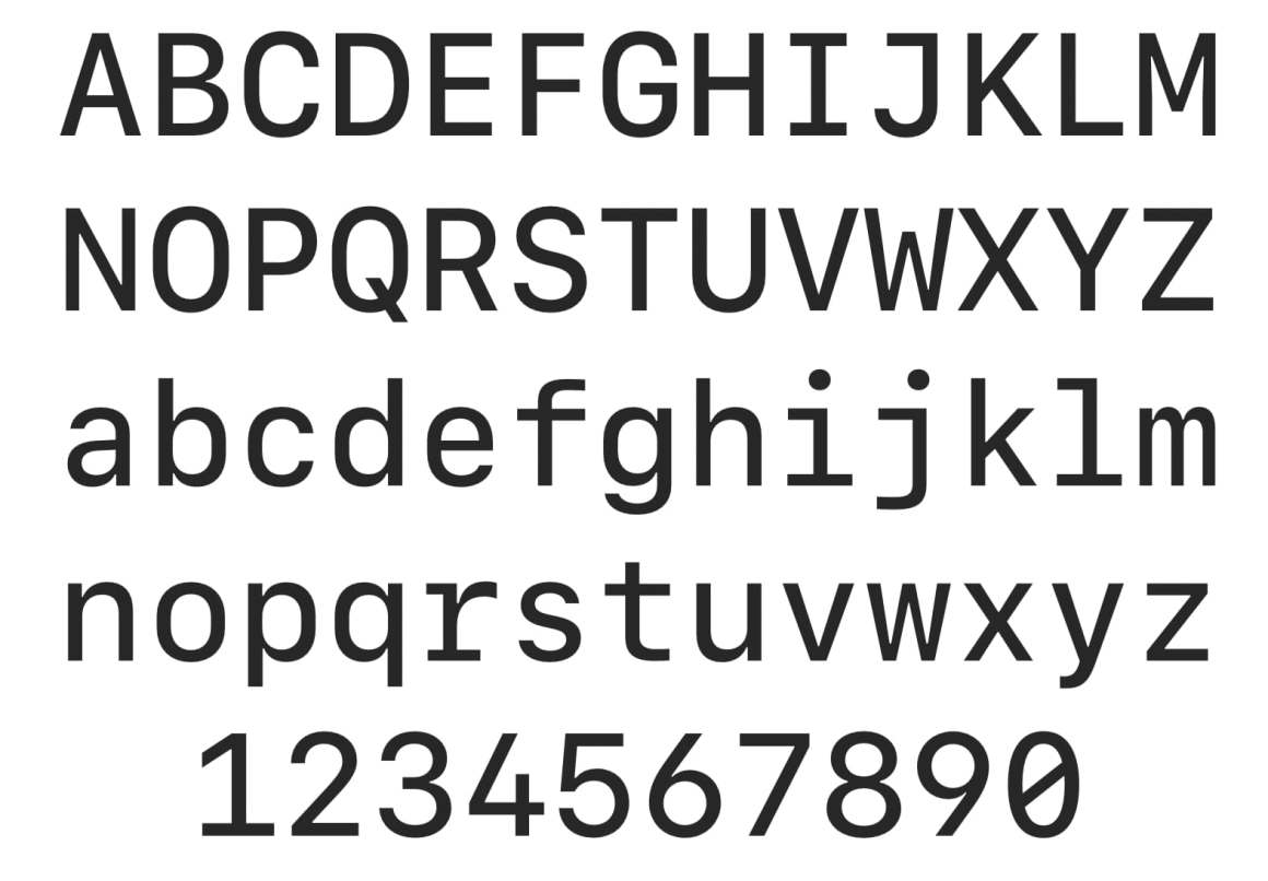 SF Mono
Introduced in 2016, SF Mono is part of Apple’s San Francisco font family. Its license prohibits usage beyond default Apple applications like Terminal and Xcode. This means that third-party code editors, such as Sublime Text or Microsoft’s Visual Studio Code, will have to fall back to the previous default macOS font, Menlo. If you really like SF Mono, there are still ways that you could use it anywhere you want (the morality of proprietary font usage is controversial, but there are a few tutorials online that teach you how to do it. Spoiler alert, it’s not hard at all).
In terms of the design, I find SF Mono more geometric than neo-grosteque, especially with the perfectly round curves of 5, 6, and 9. The long serifs of ‘i’, ‘j’, ‘l’, and ‘r’ contribute greatly to the overall neat, well-ordered, and rigid feel of the typeface. However, the trade-off of tidiness would be the less relaxing vibe that SF Mono gives off. This is why every time I come back to it, I psychologically feel more uptight and as a result, get tired more easily. Regarding readability, Apple has nailed it here — I can recognize characters with ease even at much lower font sizes.
Menlo
A decade ago, Menlo replaced Monaco as the default monospace font on macOS. After a couple of years, Menlo was replaced by SF Mono.
 Menlo
Menlo
To understand the design of Apple’s Menlo, we must first talk about Bitstream Vera Sans Mono, perhaps the most influential monospace font in recent typography. The later popular DejaVu Sans Mono, for example, is based on Vera, with modifications to certain letters, and a greater coverage of Unicode characters.
Apple’s Menlo, the default system font from Snow Leopard to El Capitan, is in turn based on DejaVu with little modification. In fact, in the following picture you can see that Apple’s Menlo barely changed anything from DejaVu Sans Mono, except for the lower position of the asterisk, the enlargement of quotes and periods, and changing a dotted zero to a slashed zero. The differences are highlighted in red for DejaVu and cyan for Menlo.
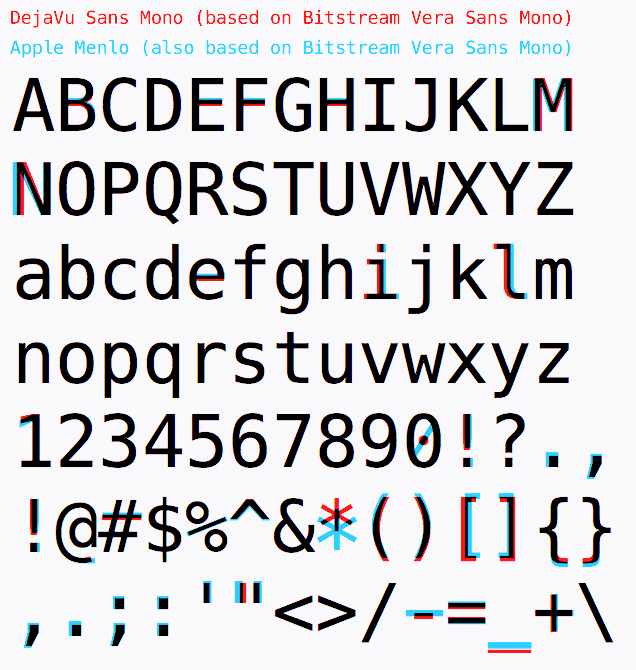 Source: http://luc.devroye.org/fonts.html
DejaVu Sans Mono
 DejaVu Sans Mono
Having discussed Menlo, there’s little left to say about DejaVu. I have never really liked this font because I find the dashes (minus symbol) too short and the dots and commas too small — two things that Menlo fixed. In addition, the font renders suboptimally on the Windows 10 operating system regardless of screen resolution. However, there is no denying that DejaVu Sans Mono is a highly practical font with a massive collection of Unicode characters, and its derivatives, Menlo and Hack just to name two, are tremendously popular among developers.
Roboto Mono
 Roboto Mono
Roboto Mono is developed by Google as part of the Roboto family, which is a constantly evolving typeface that is widely used in Android devices and websites for its superior readability. Its non-monospace sans serif version, Roboto, is currently the most popular font on Google Fonts.
Roboto Mono, along with DejaVu Sans Mono, is sadly at the bottom of my preference list. For the record, I never really enjoyed its cousin, the popular Roboto, either, but that’s for some other time. I cannot enjoy Roboto Mono as much because I feel that it lacks personality. More abstractly, it tries to be a “safe monospace” font that stays out of the way and isn’t ambitious at all to develop its own identity.
However, this is just my opinion. It doesn’t affect the fact that Roboto Mono is beloved by many developers, especially if they want to convey a “modern” touch to their projects. Examples in the Emacs community include the lsp-mode documentation (notice the font used in the code blocks) and the elegant-emacs project.
Structurally and stylistically I find this font comparable to SF Mono’s uptight neatness, albeit an inferior version of the latter. The upside is that the entire Roboto family has a highly liberal license, and is free to use however you like.
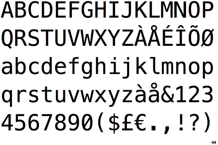
Monaco
 Monaco
Finally, we have Monaco — and man is this font adorable! Monaco is my favorite Apple font, and I use it a lot (alternately with Consolas) back in my MacBook days. When I switched over to Windows 10 and WSL2, one of the first things I did was try to install the Monaco TTF file on my machine. Sadly, the font isn’t meant for operating systems other than macOS, so although it technically shows up rather correctly, you could always tell that some tiny details in the font’s proportions are a bit off.
It’s almost impossible “not” to identify this font — Monaco gives off such a bald character with its angled ovals in “a”, “g”, “q”, zigzagging “i” and “l”, and perhaps most noticeably in code, the exaggeratedly curvy parentheses. In fact, if you put an opening and closing parenthesis next to each other, they’d almost form a circle. Similarly, if you have an empty pair of square brackets, they’d almost form a square. Lastly, Monaco is somewhat narrower than other popular monospace fonts, so with the same font size, you could fit more horizontal content on the screen.
There is one downside to using Monaco, though. Because of its overly curvy appearance, it’s sometimes hard to align the code visually despite it being a monospace font. Metaphorically, it’s like the parentheses are fighting to leave the places they are positioned at, and each character is ballooned to invade the space of others.
Concluding words
That’s all for this journey of exploring system default monospace fonts! Hope you enjoyed reading it and perhaps learned something new.